Growth
Industrial design Branding
User Interface Design
The purpose of this solo project was to create a phone-docking product.
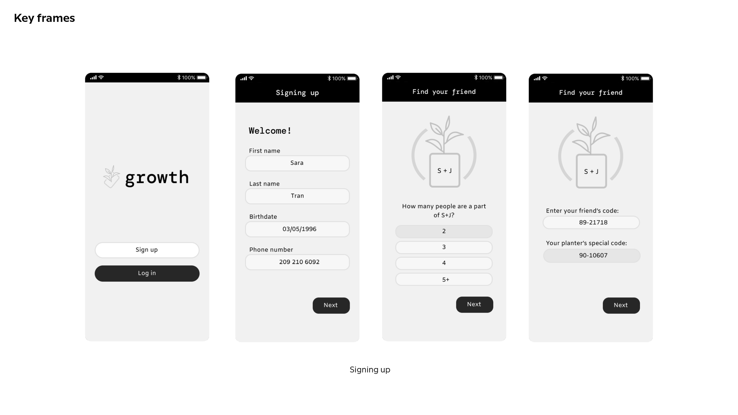
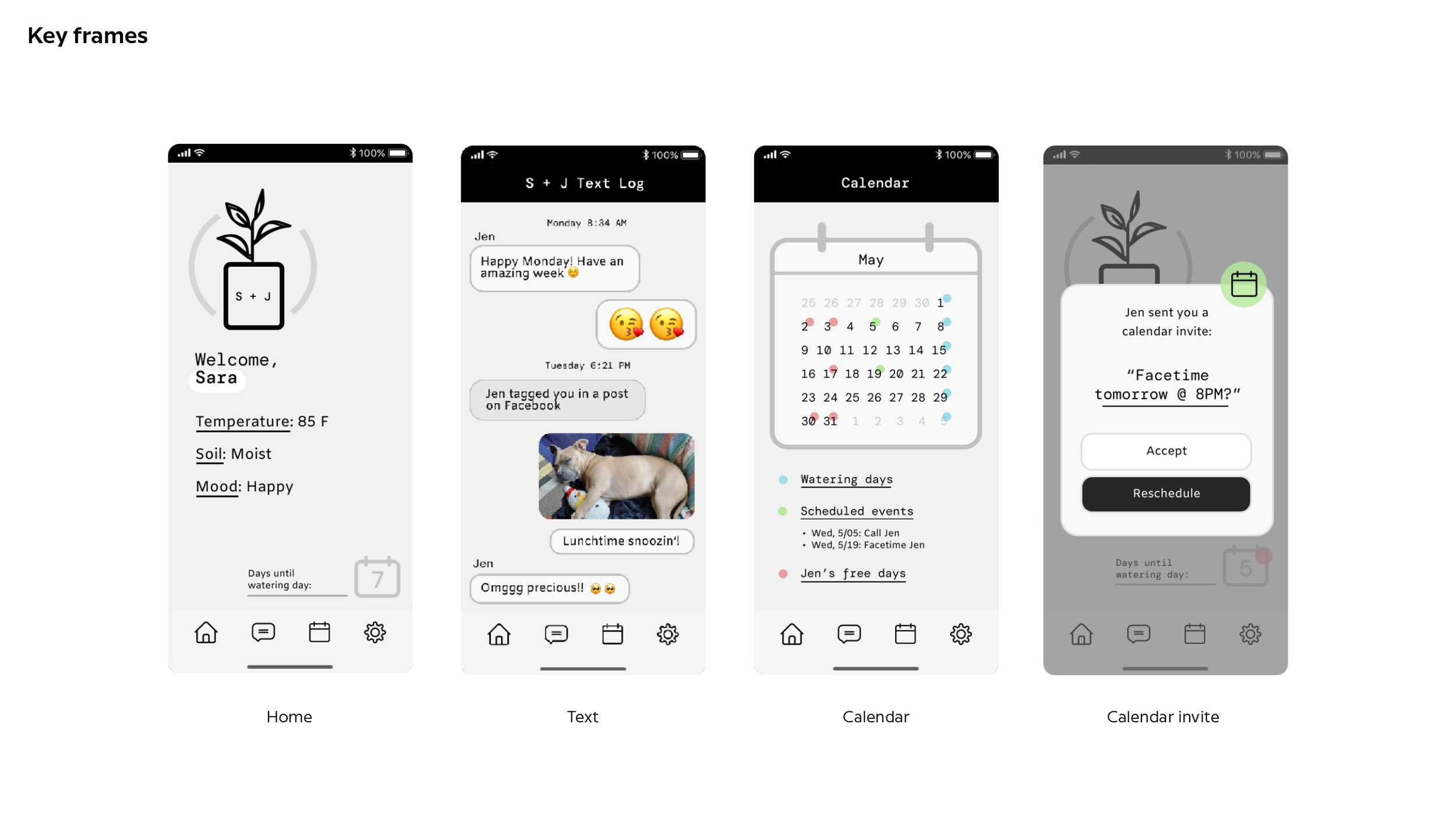
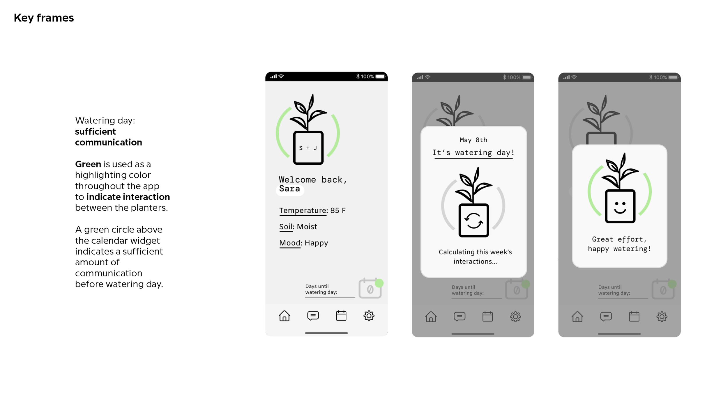
I designed a planter and app called “Growth,” a unique system that encourages meaningful connections. By syncing with your phone, Growth tracks your communication with friends and family. The more you interact, the more your plant thrives.
It serves as a reminder to stay connected and a tangible representation of your flourishing relationships.
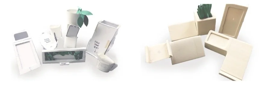
Concept exploration and selection: Using methods from IDEO

Our professors introduced us to a way for rapid concept ideation used by IDEO, where you collect a scavenger hunt for items and apply concepts to them.
For me, a small cactus sparked the idea for a visual metaphor for relationships between people.


From there, we continued brainstorming using sticky notes to flush out the concept. I made some quick mockups to visualize how I wanted the form to look.
When’s the last time you realized, it’s been months since you and a good friend—sometimes even a best friend—last spoke?
With busy lives and schedules, this happens more frequently than we’d like to admit.

Problem: Life gets hectic, and maintaining relationships can be difficult.
↳ Project goal:
Instead of accidentally leaving relationships on the back burner, my solution was to bring the relationship to life beyond a screen, visualizing its health with a real plant.

Mood board keywords:
Calm, quiet, peaceful, to juxtapose the hecticness of a busy schedule.
I also asked myself, “What textures and materials pair well with the greenery from a plant?”
Design goals
〰️
Positive UX
〰️
Harmonious
〰️
Intuitive
〰️
Unobtrusive
〰️
Design goals 〰️ Positive UX 〰️ Harmonious 〰️ Intuitive 〰️ Unobtrusive 〰️
Positive UX

The product should offer a space for mindful reconnection with the friend.
Harmonious

The placement of the phone and product should be visually balanced because the experiences are interconnected.
Intuitive

The product should be simple and easy to use, supporting the users’ communication as priority.
Unobtrusive

The product will live in a wide range of users’ homes, so its aesthetics should be adaptable and unobtrusive to its environment.